Quick View
Release Date: April 1, 2021 (August 27, 2020 for PC)
Price: $14.99
Rating: T for Teen
Platform: Switch, PC
A game key for A Long Way Down was provided by Forever Entertainment.
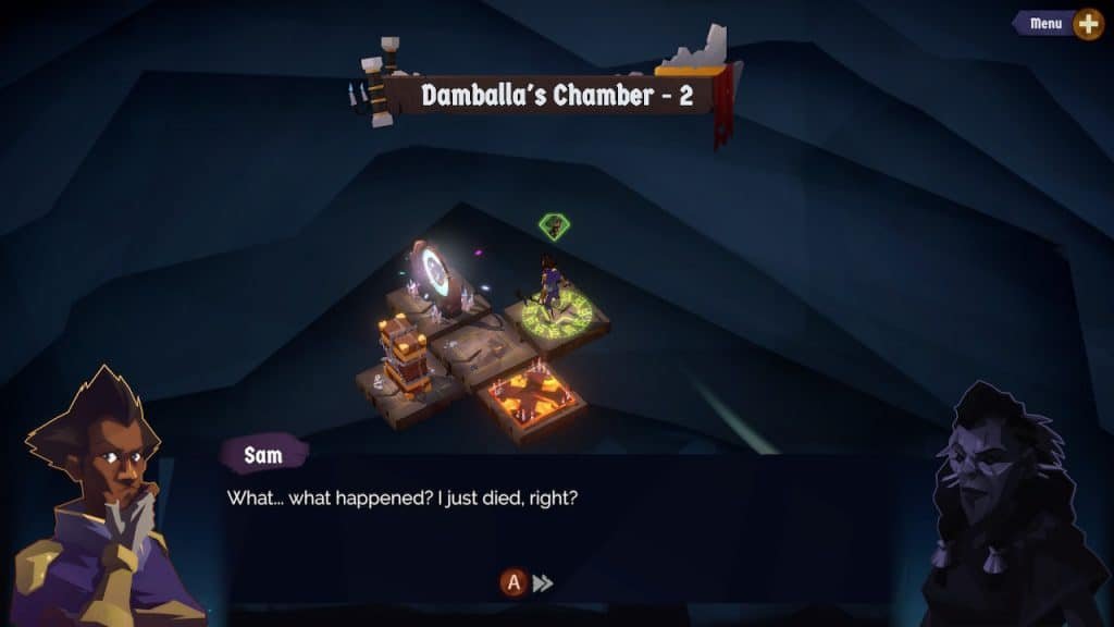
A Long Way Down touts itself as a deck-building rogue-lite. You play as a character navigating Limbo to try to find their way to a peaceful afterlife. The game has a gorgeous, dark art style, and story to match. Everything about this game should be right up my alley. I love other rogue-lite games. Sadly, I’ve put this one down after several hours because a rough onboarding and several quality-of-life issues keep getting in the way of the fun.
The Super Intriguing Gameplay Loop

There are two halves to the gameplay in A Long Way Down. First, you navigate a map, then you go into battle.
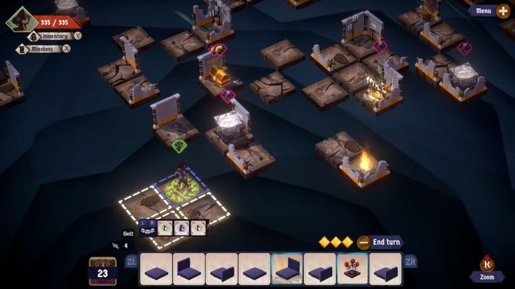
Each level of the game drops you onto an isometric grid. There are several floating islands spread out across it, with empty voids between them. You draw from a deck of tiles and place them to create pathways between these islands. As you explore, you'll open treasure chests to get new cards and gear, find stacks of more tiles, and battle enemies. After a few actions, the antagonist of the game grabs one of your tiles and places it for you, then the enemies move. This bit of randomness sometimes leads you into battles you weren’t quite ready for yet.
The map mechanic is neat, but I’m not sure how much I love it. I think the strangest thing for me is that you can actually see the whole level from the start. You'll know where all the interactable items and enemies are right away. A feeling of exploration would make deciding how to use my tiles a little more interesting, I think.
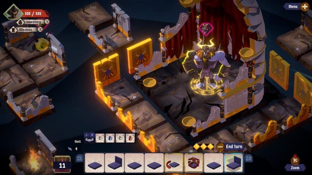
In battle, you primarily draw actions and attacks from a customizable deck of cards. There are also a few extra actions that vary depending on your character and gear. You use a few action points to play cards that hurt your enemy, lower their stats, or raise your own, and then they get a turn to play a card against you.
It's a formula that you can find a lot of games these days, but one that I typically dig.
The “Rogue” of it All

Weirdly, I don’t really see this game as fitting in to the “rogue-like” genre. Dying kicks you back to a hub with only a fraction of the resources that you’d gathered, but then you start a new random iteration of the level you were on, rather than back from the very beginning. In other words, once you beat level two you will always have everything you unlocked in level two. Dying on level three doesn't do anything to the progress you made on level two.
I don’t see that as a bad thing, it just seems strange to call this a rogue-like game. Each individual level is randomly generated, but the permanent progression doesn't feel rogue-ish to me.
As far as I’ve gotten in the game, the combat feels pretty good, and progressing by collecting cards and resources through a level and then upgrading your gear before moving on to the next feels nice. Unfortunately, the tutorials in this game are pretty rough. It took me quite a while to feel out on my own how different systems worked and interacted with each other. That would have been okay, except that the controls, menus, and presentation all seemed to be pushing against me as I tried to figure things out.
Diving into the Map

I really want to like A Long Way Down. The general art style is fantastic, the map building mechanic is interesting, and the card combat should be right up my alley. Unfortunately, there’s a lot of small thins that really got in the way of me enjoying the experience.
I was visually overstimulated by the map the first time I saw it. Some of the tiles drift up and down, but not all of them. The ones that do bounce aren’t all in sync with each other, so some are moving up while others move down. Then in the background you’ve got a sort of smooth gradient, but occasionally some particle effects drift across it.
None of this looks bad on it’s own, but it’s just a lot to have happening all at once.
Actually navigating around the map doesn’t feel great, either. The isometric perspective is slightly shifted to one side so that it feels like you should press the control stick sort of North-by-North-West to go up. After some experimentation, I realized it actually just wanted me to press up. I switched to using the D-Pad and navigating started to feel better. Unfortunately, when I switched to handheld the D-Pad inexplicably didn't work for navigating the map at all.
Time for Battle

Once you get into battle, things generally work pretty well. There are a ton of inputs you can put in, varying from selecting a card, checking your status and the enemies, selecting potions, and seeing what card your enemy will use on their next turn. The controls are well labeled on the screen. The purely turn-based combat means you’ve always got time to find what you are looking for, but it’s not intuitive.
Pressing left on the analog stick, left on the D-Pad, the Left Bumper, and the Left Trigger all do a totally different thing, which just feels like a lot.
The controls in battle are functional, just confusing. Well, mostly functional. Pressing Up on the D-Pad shows you the next card your opponent will use, which works great in a one-on-one fight. When there are multiple enemies, though, there doesn't seem to be a way to see what attacks they will all use.
Technical Issues

On a technical level, the performance of this game is often much slower than it seems like it should be. Moving around the map often makes things slow down a bit. This is super noticeable since there are always so many things in motion.
I've had the screen freeze in the middle of loading the loading screen more than once.
There are several menus to navigate, and it can take more than a full second to switch between them. That lag just feels bad. On top of that, the controls in the menu have two big quirks. First, you for some reason press A to confirm selections on the map and in battle, but use Y to equip a selected item or card in a menu. Second, you can use Left and Right on the D-Pad to navigate a sub-menu, but pressing Up or Down takes you to the next sub-menu, instead of to the next row in your current sub-menu!
Final Thoughts
I looked up some PC footage after I stopped playing the game on Switch. In that version, it looks like every interaction in the game is controlled with the mouse, which seems much simpler. The complexity of the controls and strange decisions related to translating this game to the Switch are the biggest weak spot.
All of these little hitches kept getting in the way of me having a good time building up a deck and using it to clobber enemies. The story and concepts at work in this game really do intrigue me, but it seems like it was a struggle to figure out how to fit the whole package onto the Nintendo Switch. If you don’t mind the game chugging a bit here and there and can wrap your head around the variety of controls you have to use, there’s an interesting game to be played. On the other hand, it might be worth checking out the PC version.
If this game gets a patch to address stability and iron out some of the control issues, I'll dive back in. Heck, I'd play this game solely through the Switch's touchscreen if they added that in as an option. Otherwise, I think I'm about finished with A Long Way Down.
Geek To Geek Score: 2.5 out of 5
You can watch TroytlePower's live first impressions of A Long Way Down on his YouTube Channel or listen on his podcast.

