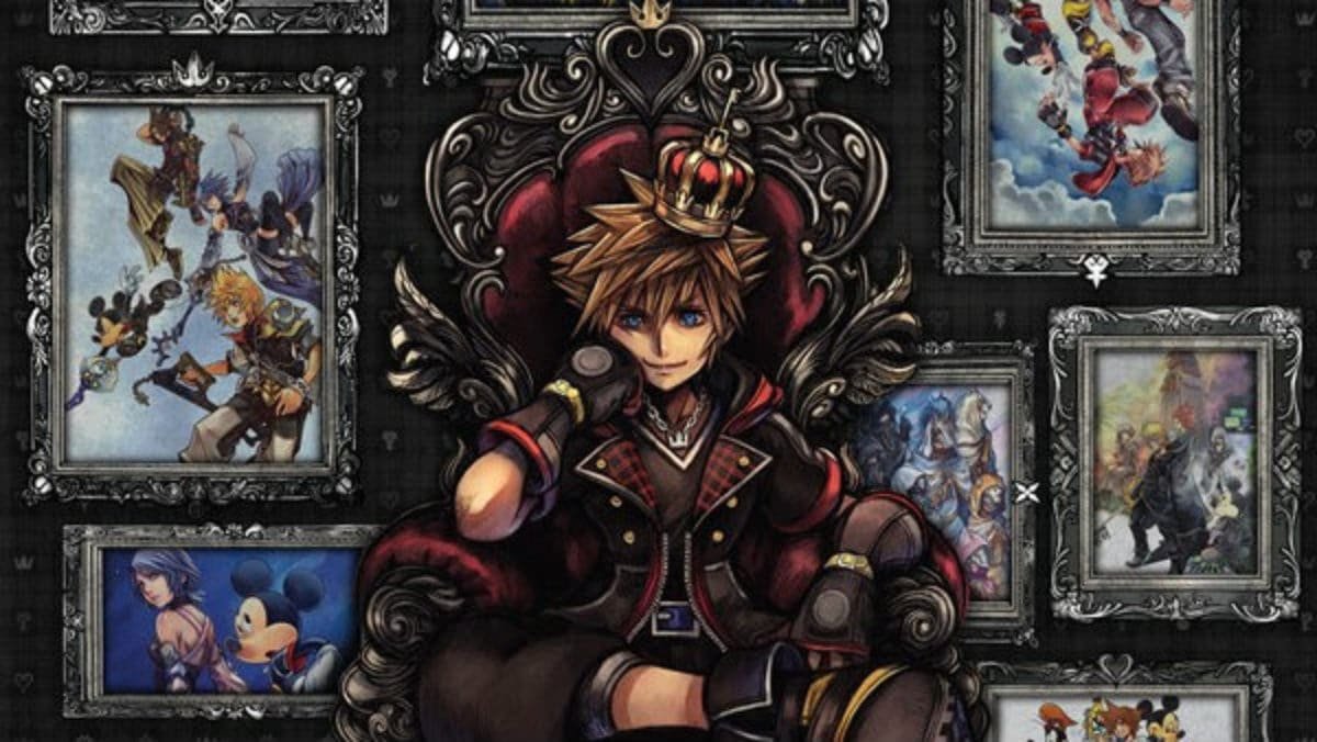
There’s a brand new Kingdom Hearts game on the horizon, and alongside it some spiffy new box art by Tetsuya Nomura. As a series that spans two decades and more than a dozen titles, we thought it would be fun to take a look back at the best Kingdom Hearts box art and see how Melody of Memory stacks up. I’ll be listing my five personal favorites, but feel free to let me know what yours are as well!
5. Kingdom Hearts

To me, the very first Kingdom Hearts game has always had a unique vibe compared to its successors. It’s the beginning of a strange, unknown journey, and there’s an air of mystery to everything that’s going on.
This mysterious quality is represented very well in the game’s box-art. The dark background combined with the ominous heart-shaped moon really sells the air of mystique this game possesses, and it will always stand out from the others for this reason. I feel like the box art was Square’s way of grabbing the attention of their Final Fantasy fanbase, who were probably very skeptical of Kingdom Hearts initially.
4. Re:Chain of Memories
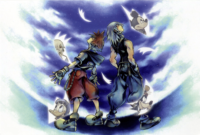
The PS2 remake of Chain of Memories isn’t one of my favorite Kingdom Hearts games, but I’ve always admired its box art. The game features two separate campaigns from both Sora and Riku’s perspective, and the box art captures this duality perfectly.
Not to mention that the blue-ish color palette, combined with the starry sky background, is just really pretty. The clouds also help to give it a nice dream-like aesthetic, which is something that would later be expounded upon in Dream Drop Distance.
3. Re:Coded
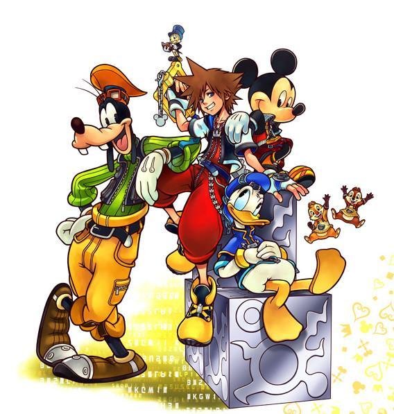
I’ll be honest; I’ve never played this game, and I probably never will. It’s essentially a retreading of the original Kingdom Hearts, and it’s also the one game in the series that doesn’t contain super critical plot importance, so there’s just not a lot of motivation for me to. I do, however, really like what they did with its box art.
One of my biggest gripes with the Kingdom Hearts series over the years is that it takes itself way too seriously at times. Nomura loves to wax-poetic, and it’s as though he forgets this is a series featuring Disney characters battling evil with giant keys. Re-Coded’s box art gives the impression of a fun, lighthearted adventure, which is really what Kingdom Hearts is at the end of the day. I’m also a big fan of the data-ey look of the white numbers and letters over the gold background.
2. Birth by Sleep
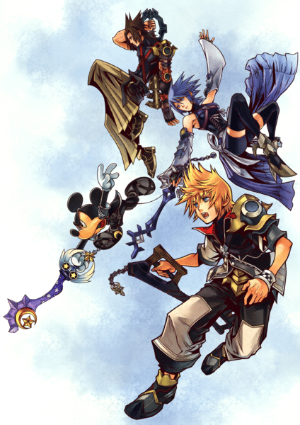
Birth by Sleep is easily one of my favorite entries in the series. It introduced one of my favorite characters, Aqua, and although it wasn’t the first game to utilize the command deck combat system, it definitely took that system and refined it. That's why I like that the cover art here is nice and simple. It tells you everything you need to know about the game and its multiple-protagonist approach.
I’ve always loved the character designs for the Birth by Sleep trio, and the cover is some of my favorite Kingdom Hearts art out there.
1. Kingdom Hearts 3
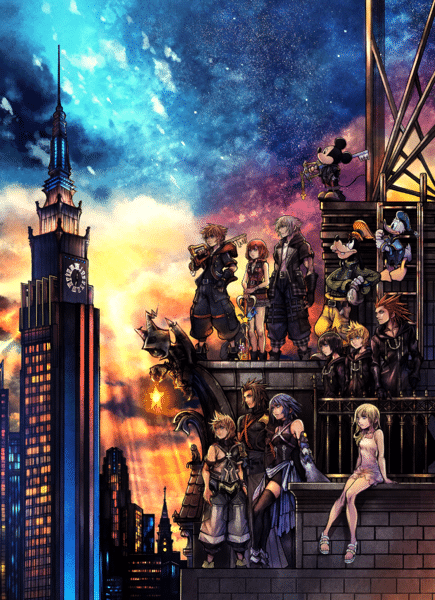
Normally, I’m a fan of the more minimalist cover designs, but Kingdom Hearts 3 needed to go big or go home. With a near fourteen year gap between it and the last numbered entry, expectations were pretty high for this game.
Whether or not the game actually met those expectations is another discussion, but the box art certainly delivered.
KH3 is the Avenger’s Endgame of the series, the grand finale. Every Guardian of Light is present and accounted for, standing before a gorgeous multi-colored sunset. I actually loved this artwork so much that I got it printed on a t-shirt the same night it was unveiled. This is one of my favorite video game covers period, not just among Kingdom Hearts art, and it easily earns the #1 spot for me.
So How Does Melody of Memory Cover Art Compare?
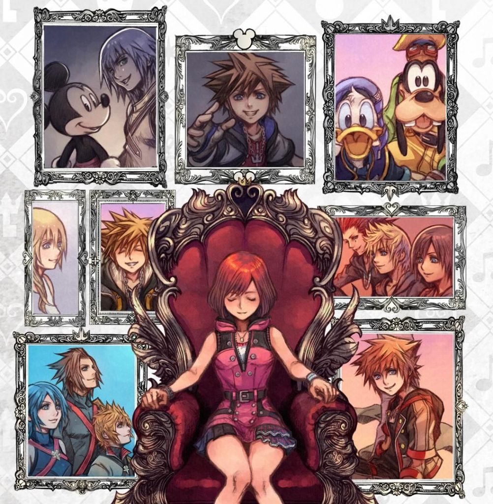
Square Enix has only just revealed the newest Kingdom Hearts game. And we still don't know a lot about Melody of Memory. We did, however, get a look at the game’s box-art, and there’s a lot to take in.
Kairi takes the spotlight, as she’s the protagonist of this entry (it’s about time!), and she sits atop the same throne that we saw on the cover of the All-In-One collection.
In an interesting revelation, a number of observant fans have noticed that some of the portraits surrounding her are actually the ending scenes of the three numbered games, viewed from Kairi’s perspective. So not only is the box art aesthetically pleasing, but it also contains some Easter eggs. Pretty cool!
For these reasons, I’d definitely rank Melody of Memory’s box art as some of my favorite Kingdom Hearts art, and I can’t wait to actually get my hands on the game in November. The gameplay looks fun, but the artwork makes me want to dig into the story and see what is going on. Especially since Kairi seems to be taking the lead.
What is Your Favorite Kingdom Hearts Cover Art?
Thanks for reading to the end! If you’re interested in more information regarding Melody of Memory, check out the new trailer for it here. And if you have your own thoughts on anything Kingdom Hearts related, art or gameplay or characters or anything else, be sure to let us know in the comments. We’d love to hear from you!

