
With cards to collect and nodes to explore, Gordian Quest brings some of my favorite rogue-lite mechanics into a persistent world for an epic adventure.
Quick View
- Title: Gordian Quest
- Release Date: October 26, 2023
- Price: $19.99
- Suggested Audience Age: Rated T for Teen by the ESRB
- Availability: Switch (Reviewed), Steam, GOG
- Recommended for fans of: Building Decks, Delving Dungeons, and Slaying Monsters
Geek to Geek Media was provided with a review copy of this title.
I tend to dip in and out of deck builders pretty quickly. I like them conceptually and dig the first few hours of building up complexity and synergies between cards. Unfortunately, most deck builders are built around a rogue-lite structure. Unless there’s a really solid progression loop I tend to lose interest in roguelite games, which means most deck builders start to wear thin just around the gameplay getting interesting.
Gordian Quest caught my eye when I saw screenshots showing a deck of cards and a bit of a grid-based battlefield, but it has been the perpetual forward motion of the campaign that has me hooked.
Combat is Key
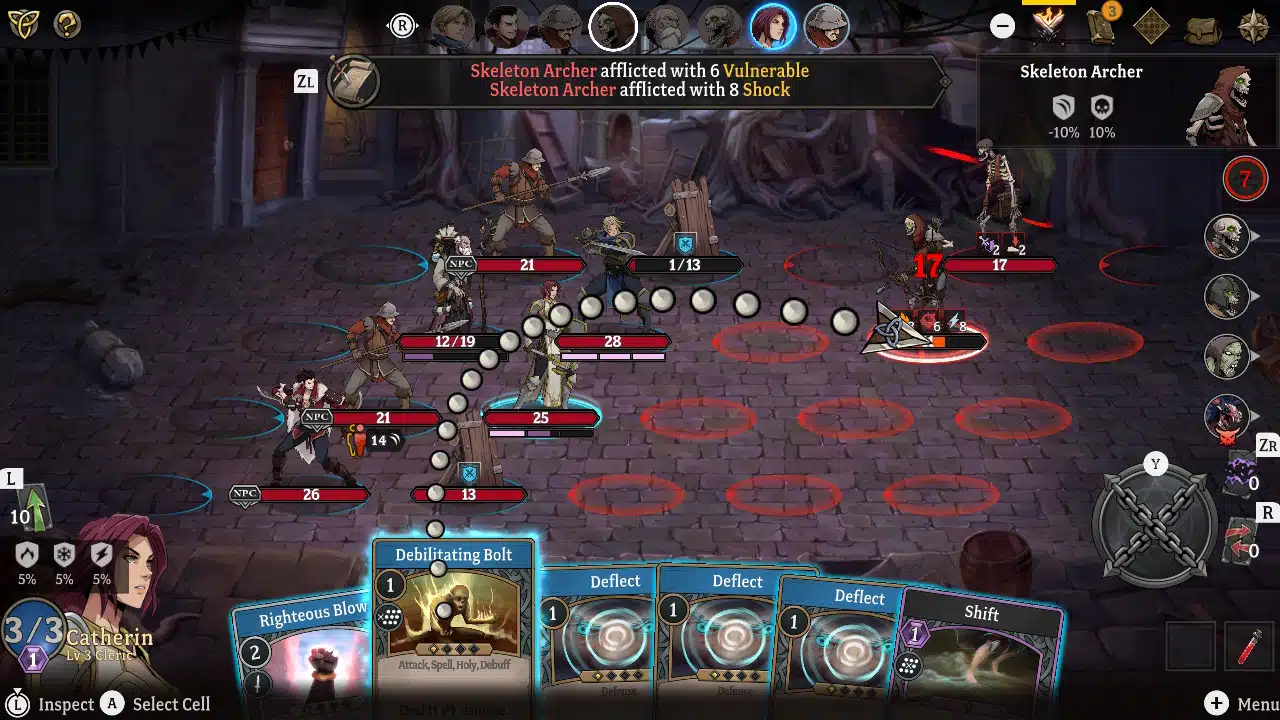
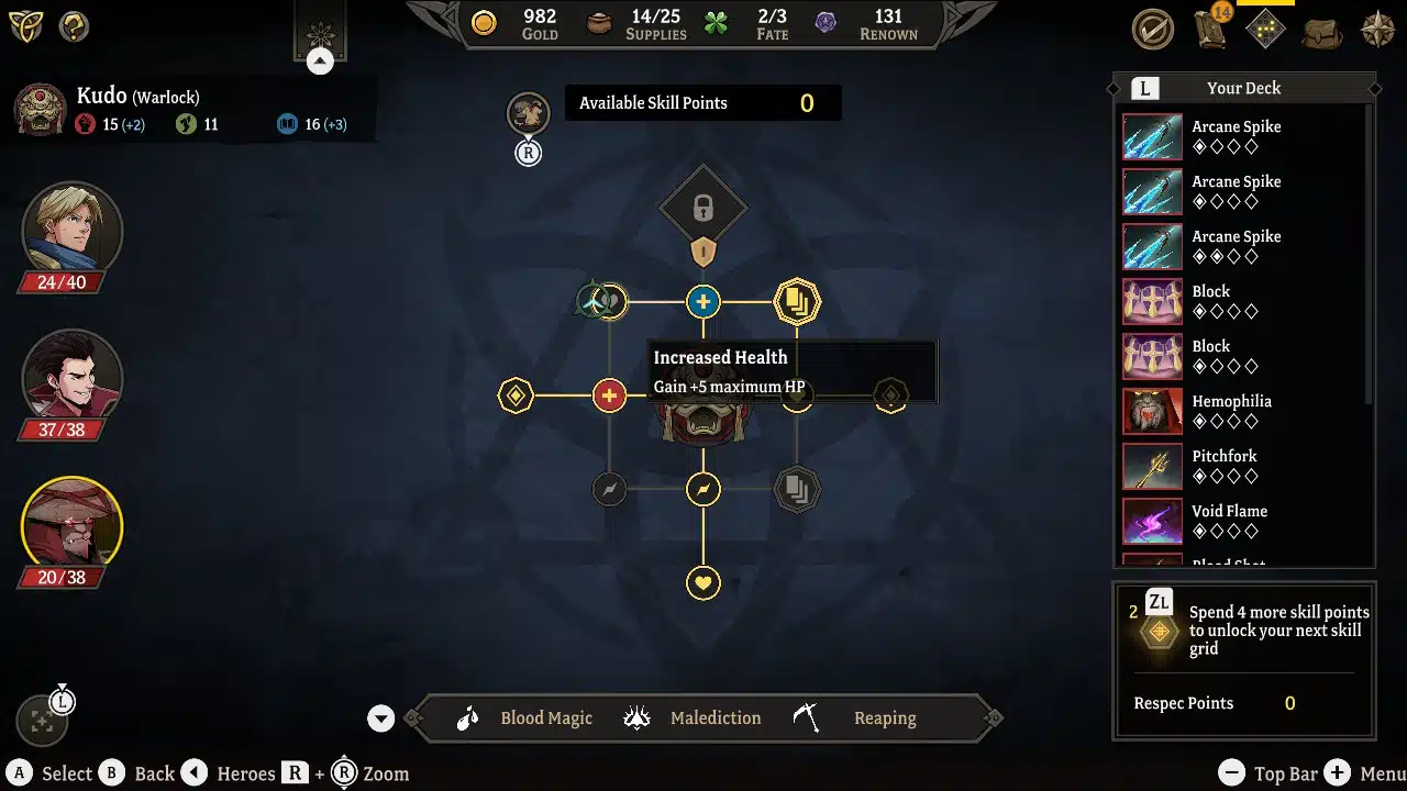
There are a lot of overlapping gameplay systems in Gordian Quest, but the main gameplay system has you controlling the actions of three characters through individual decks of cards to battle enemies. Each card uses action points, and in general, you can take three actions on a turn.
The basic format is familiar, but two twists make this feel really fresh. First of all, combat in most of these games is usually just in a line, but Gordian Quest has your characters, allies, and enemies laid out on a small grid. This isn’t a full-on tactics game, as your “team” is always on the left while the foes are on the right. Still, being able to think about moving your units to line up attacks and defenses or to straight up avoid incoming assaults is engaging.
On top of the grid, being able to control three characters in battle gives you a lot of options on approaching battle. In some cases, it’s best to throw all of your attack cards at one strong enemy for an overwhelming onslaught. In other engagements you are better off spreading damage and status effects out across everyone you face.
An Expanding World
I’m really impressed by the combat in Gordian Quest, but the framework for why you’re battling is even more surprising. When you start the campaign, you choose an adventurer who begins the story just happening to be in a medieval town as it comes under siege from an army of the undead.
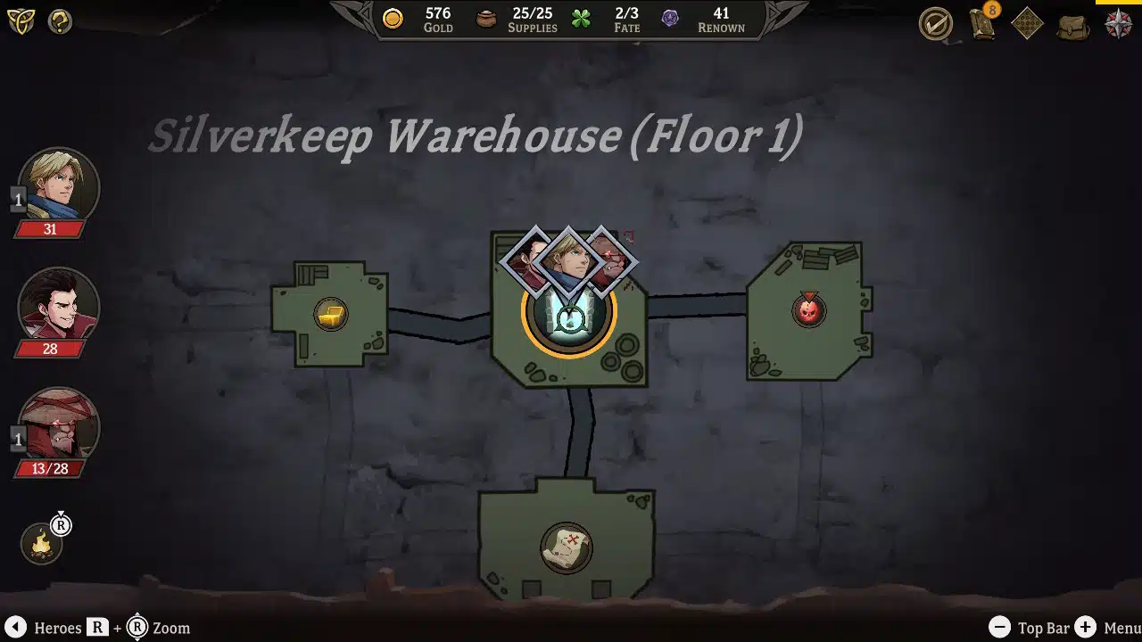
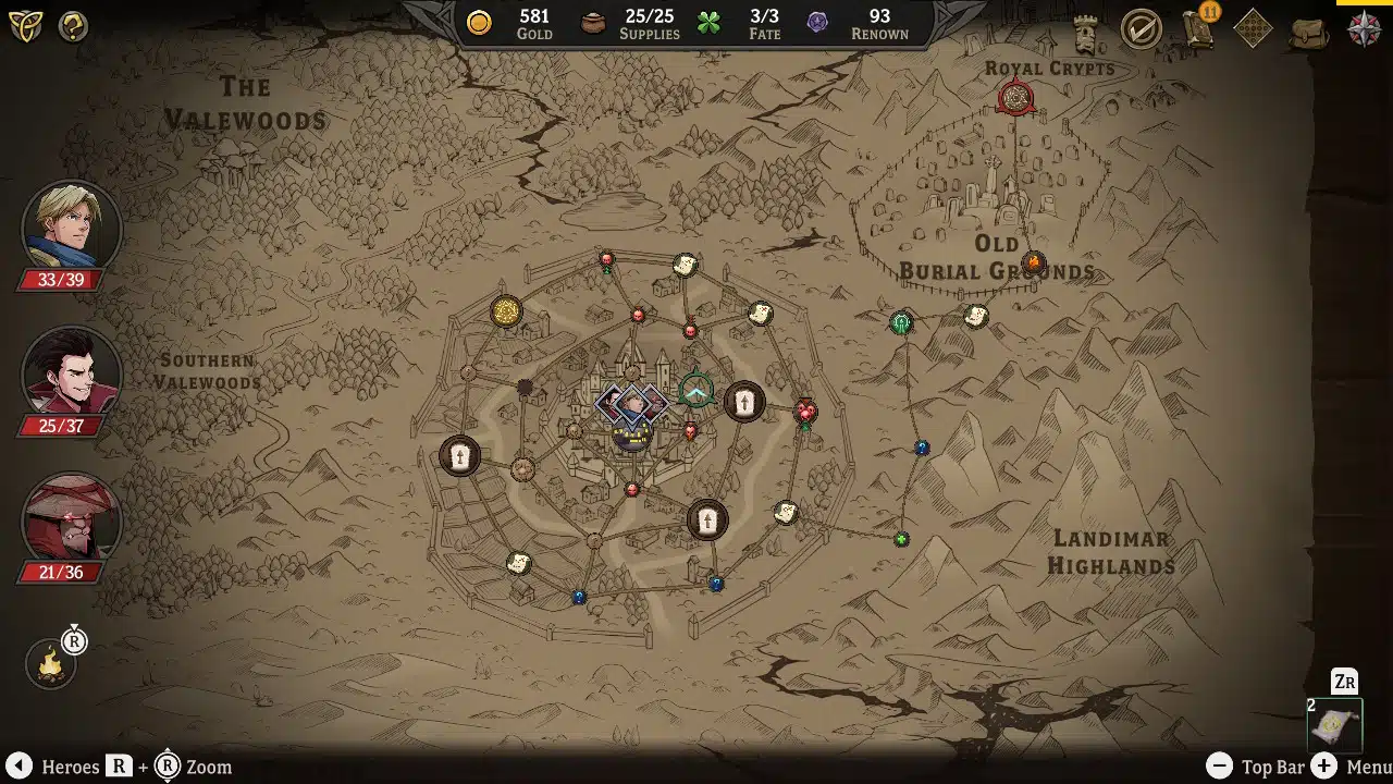
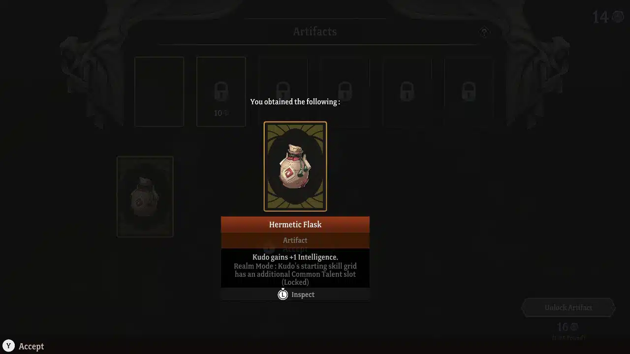
The main hub is the town center, where, after a few upgrades, you can rest, revive, and recruit new heroes, or shop for gear to beef up your characters. The world outside of that safe space is a radial arrangement of interconnected nodes, which can represent battles, dungeons to explore, events you’ll roll a D20 to resolve, and more.
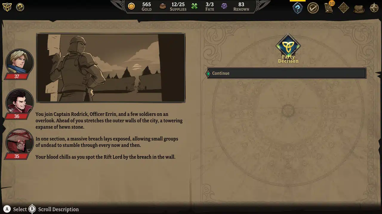
Folks from town send you out on quests to visit specific nodes, and as you progress the story you unlock more places to adventure to. It’s an incredibly simple way to show a world, but it works really well. It’s got all the speed of progressing through the typical nodes you find in rogue-like games, but with a permanent map that you can actually connect with.
Controller Woes
My only real complaint about Gordian Quest is that the controls can be a bit clunky on the Switch. Whether it’s in combat or on a map screen, there are a lot of things you can interact with at any given time. Simply choosing a card to play or the next node to travel to is easy, but anything beyond that gets… weird.
As a snapshot example, to zoom in or out on the map you hold the right shoulder button and then move the right stick. Okay, fine, holding a button to change a stick's behavior is nothing new. The problem is, without holding the right shoulder button the right stick doesn’t do anything at all. It’s not hard to hold the button, but it complicates how you interact with the game for no reason. Odd inconveniences like this are all over the menus in Gordian Quest.
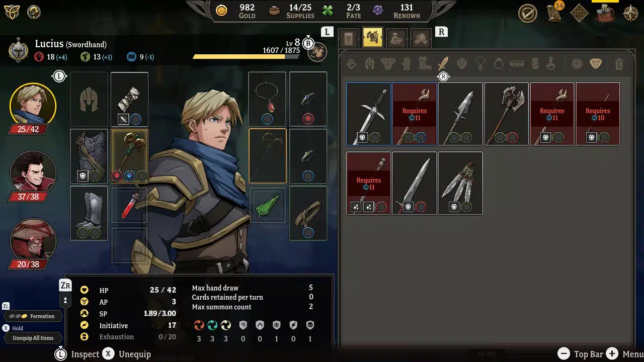
Say you want to equip a new piece of gear while you are in town. There are character portraits on the side of the screen, but when you use the analog stick to move your cursor it stops short of that section of the interface. You have to hit left on the D-Pad to highlight the character portraits, then hit A to open the character menu.
This will show you your equipped gear on one side of the screen and your inventory on the other. To equip a pair of boots you have to use the analog stick to highlight what you want, then highlight the boot inventory slot (as if you might want to equip them elsewhere), then hit A twice (for some reason), and then hit B twice to get back to the map. To level up you hit the D-Pad as before, but then hit Y.
It all works, but it’s not intuitive. There’s no input to switch from inventory to your deck to your leveling-up skill tree or to switch from one character's equipment to another. It’s just clunky enough to feel off. Thankfully, when playing handheld you can use the touchscreen instead of the controller to eliminate almost all of that awkwardness.
Final Thoughts
With a solid deck-building combat system and a campaign mode that is engaging, interesting, and full of surprisingly well-written moments, Gordian Quest has really impressed me. There is so much to explore in your adventure, and even easy battles are fun and engaging. And, for true sickos who won’t be satisfied spending roughly 20 hours in the campaign, there’s a whole procedurally generated mode as well!
The only real drawback here is how the controls feel on Switch. This reeks of an interface designed for a mouse that is struggling to adapt to a controller. On the plus side, though, I have to give the developers a massive amount of credit for using font sizes that are totally readable on the Switch, which even some AAA releases whiff on.